|
|
 2009 - Paintings by: Keith
 |
|
|
2009 - Paintings by: Keith |
|
2009 Exhibition of my
Current Compositions
|
for best viewing check your monitor color balance:
click here for information
Latest Painting shown first
 |
There is still some work to do on this one. But it makes use of the spreading effect in colour to give the flowers some delicacy. This type of painting takes longer. There is 20,000 plus brush strokes in layers on this canvas. Not the kind of painting production artists want to become involved in. |
 |
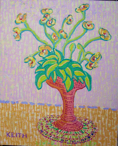
Nothing like going off in an entirely new direction. I like representational art without being too representational and this my be a happy balance. |
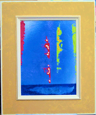 |
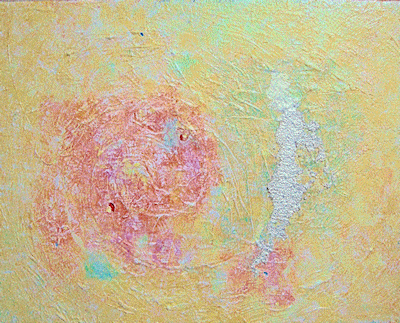
Acrylic on Board My first exploration into spray painting. The light to middle blue is without form or structure - a kind of immortality symbol. The dark blue at the bottom introduces a boundary object that hints at the mortality of creation. The violetish red and greenish yellow coloured torn shapes especially the two with straight back edges further hint at the consciousness and individuality of mortality within an imortal context. |
 |
Acrylic on Board Ok! It's evolving. The struggle between
colour and form is out in the open. My child hood was mainly right brain
artistic pleasure before work. |
 |
Acrylic on Board
Not super great but still a pull. |
 |
Acrylic on Board
Abstract Expressionism keeps pulling me. |
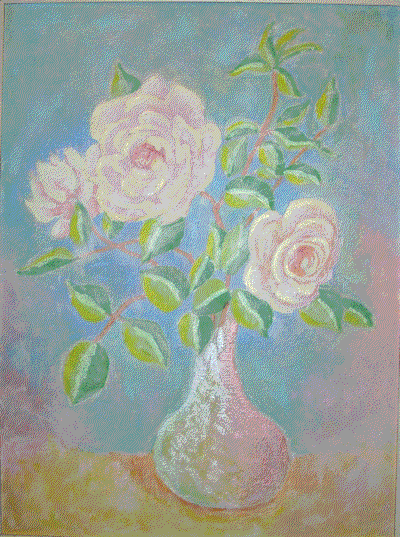 |
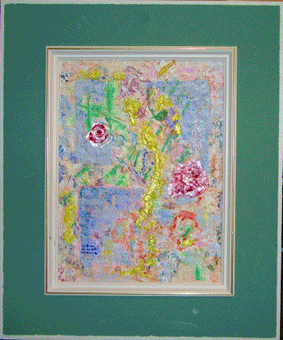
White Roses Acrylic on Stretched Canvas Playing with flowers. Kept the colours in a high key and pastel like. Went for overall unity and added interferrence paint for highlights. With the right lighting (top down) it
gives off a soft delicate glow. The glowing effect changes as you move
towards or away from the painting when going up and down the stairs. |
 |
Acrylic on Board
Had to play with some abstract expressionism. |
 |
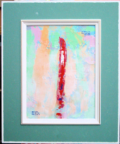
Red Vase Acrylic on Stretched Canvas Going back to colour basics. Making a more consusous effort to foccus on overall colour vitality glow. The subject acts as a carrier for the colour relationships that cause the painting to develop a particular overall vitality glow. The vase undercolour is lifeless but adding graphic marks in almost pure red-violet gave it more life more glow more vitality. Thinking of exploring the impressionist colour ideas in terms of fast drying acrylic. |
 |
2009 June 9 Acrylic on Canvas Board The date completed is the title. |
 |
2009 June 1 Acrylic on Canvas Board The date completed is the title. |
 |
2009 May 24 Acrylic on Canvas Board The date completed is the title. The shape fill colours were more thoughtfully
applied with a brush. The process was slower yet dynamic with little
to no changes. |
 |
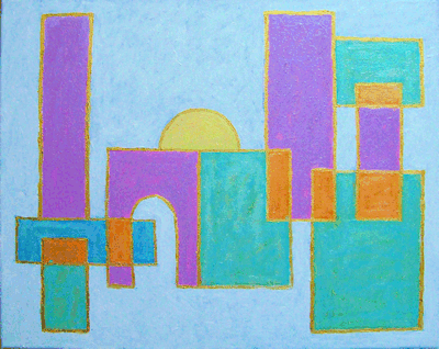
Aesthetic Variations V Acrylic Interesting! Could not have predicted
this leap from the previous paintings. |
 |
Aesthetic Variations IV Acrylic and 110lb acid free paper
on stretched canvas Not much to say about this. |
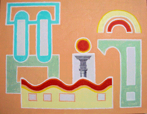 |
Aesthetic Variations III Acrylic and 110lb acid free paper
on stretched canvas Now entering the mixed media world.
The classic proportional beauty of the Tuscan column is brought out
by contrast of colour, shape, style and texture. |
 |
Aesthetic Variations II Acrylic on stretched canvas Looks like I am becoming more attracted
to the architectural style of painting. |
 |
Aesthetic Variations I Acrylic on stretched canvas A new development begins. Simple building
block shapes from my son's wood building block set. Memories of the
large community sand box that I played in as a child. Coupled with my
father's teaching that too smooth a surface ruins the quality. |
 |
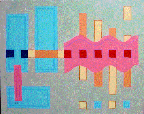
Simplex 3 Acrylic on stretched canvas The third in this series. Upon completion
of this painting I could not predict the next painting above.
I am in most cases unable to predict
the next painting. |
 |
Simplex 2 Acrylic on stretched canvas The second in this series. Greater use
has been made of ancient Greek architectural proportioning systems in
developing the geometric understructure. |
 |
Simplex 1 Acrylic on stretched canvas
Simplex 1 is also ambiguous in terms of its orientation due to a missing up down locator. |
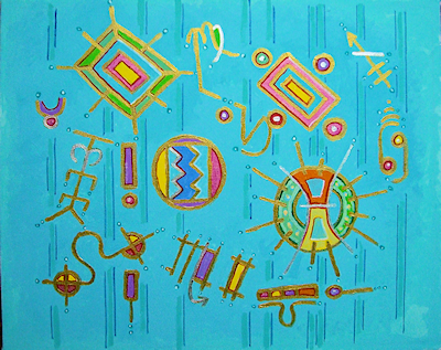 |
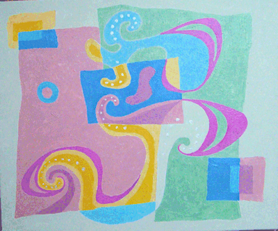
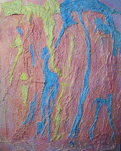
Fugue no. 1 (Thoughts) Acrylic on stretched canvas Primative and zodiac symbols (graphics) represent thoughts that enter our conscious mind. As we focuses on each graphic it enters our conscious mind. The graphic may be liked or it may be disliked. Just as thoughts that enter our mind may be liked or disliked. Our intellect normally tells us if we are being reasonable or unreasonable in our emotional judgment of specific thoughts. If our intellect becomes disturbed we may not be able to evaluate a mature emotional response to our thoughts. |
 |
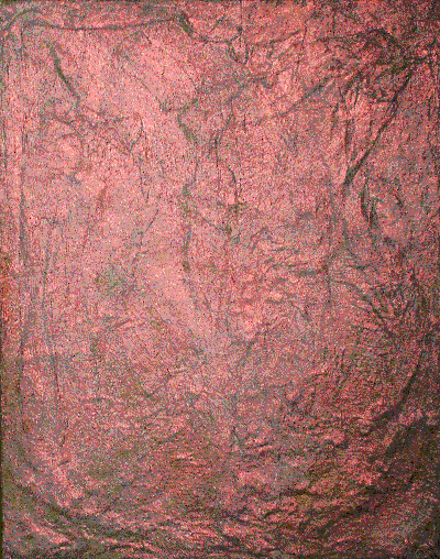
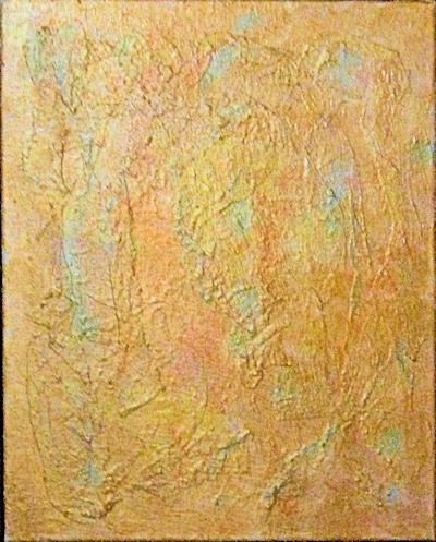
PRELUDE VII Acrylic Media over hand modeled cotton
ground on Stretched Canvas The
photo colour is not bad. The original is painted with iridescent rich
gold. |
 |
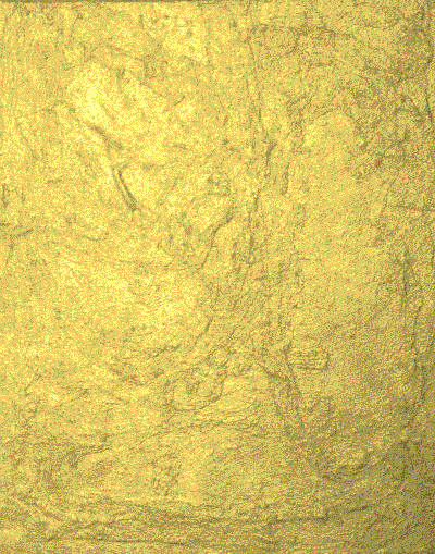
PRELUDE VI Acrylic Media over hand modeled cotton
ground on Stretched Canvas The
photo colour is not great. The original is painted with iridescent copper. |
 |
PRELUDE V Acrylic Media over hand modeled cotton
ground on Stretched Canvas These
paintings use interference paint which does not show well in these graphics. The photo colour is not bad. |
 |
PRELUDE IV Acrylic Media over hand modeled cotton
ground on Stretched Canvas Another change in direction. |
 |
PRELUDE III Acrylic Media over hand modeled cotton
ground on Stretched Canvas My problem is to gain more compositional
control over the texture shapes. The cotton adds its own direction to
mine. |
 |
PRELUDE II Acrylic Media over hand modeled cotton
ground on Stretched Canvas
|
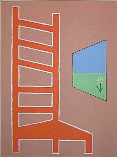 |
Mum's Window Acrylic over Stretched Canvas In her later years, when her fingers were too twisted to play her piano, she sat looking out at the world. She could see life on the street,
she could see over the river, over the distant houses up to the
mountians that touched the sky. She never heard of ZEN but she intutively lived it. |
 |
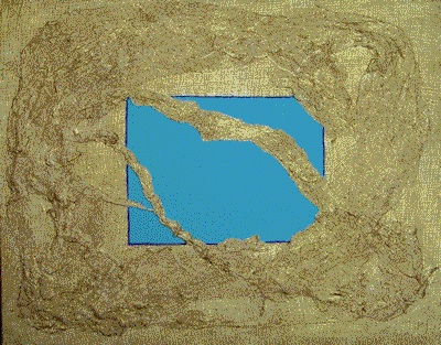
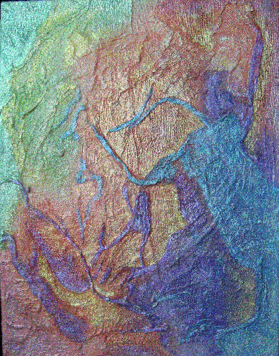
Romanesque
Wall II (PRELUDE I) 2008 Dec Acrylic Media over hand modeled ground
on Stretched Canvas This painting goes deeper into exploring
texture, movement and a highly reflective surface of glaze upon glaze
upon glaze etc. |
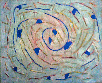 |
Ancestor Wall Acrylic Media over hand modeled ground
on Stretched Canvas Although abstract in subject it maintains
traditional picture making structure of foreground, middleground and
background. A spiral type movement simulates the primordial soup in which microscopic life forms group and regroup into larger structures. |
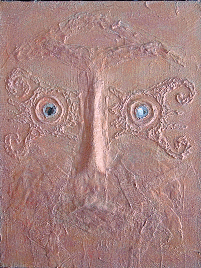 |
Spirit Wall Acrylic over hand modeled ground
on Stretched Canvas My visit to the British Museum inspired
this work. The wrappings on Egyptian mummies recalled my own teenage
experience with having a cast for two summer months. Viewing African
masks activated my long term interest in African Art. Wall Sculptures
activated my own low relief early carving efforts learned from my
father. The metalic like surface recalls my early work in copper.
The two small mirrors recalls my interest in the relationship between
self and other as dimension of life. |
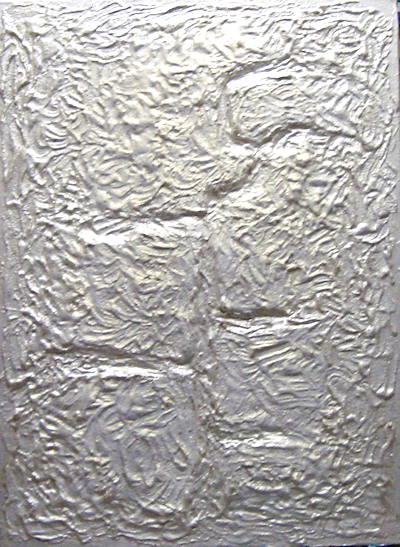 |
Silver
Wall
Acrylic
over
hand
modeled
ground
on
Stretched
Canvas This
painting
has
also
been
influenced
by
my
study
of
Romanesque
time
worn
walls
experienced
during
my
visit
to
Bath
England |
 |
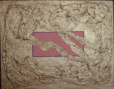
Romanesque
Wall
Acrylic
Media
over
hand
modeled
ground
on
Stretched
Canvas Inspired by my visit to Bath England |