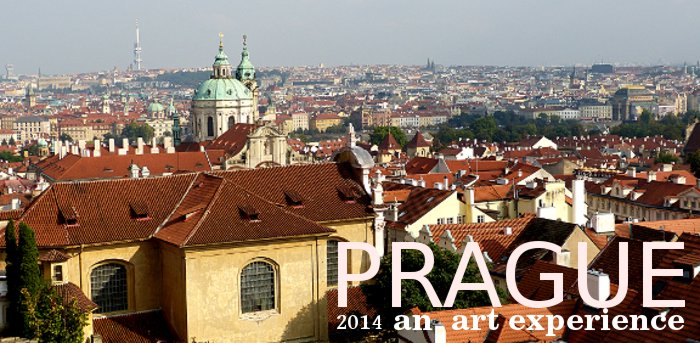
 |
|
In
September 2014 we traveled from Berlin to
Prague on a train whose end destination was Budapest. The
conductors do not
clearly announce the town or city names of each train stop and with
each unannounced stop we became concerned we would miss the Prague
station stop
and our guide waiting for us. Due to a
lack of information (being unaware Prague had more than one stop) we
unknowingly exited the train on the outskirts of
Prague and not the main terminal. The station was a dirty grungy
neglected depressing complex. It was Sunday and were fortunate to meet
a person who
spoke a few words of English and provided us with instructions on
using
the local subway system. We were also lucky in having enough money
(Koruna) to buy subway tickets. Needless to say we encountered a number
of lost travelers.
Standing on the dirty platform waiting for the subway car we were suddenly shocked at this brand new gleeming clean subway car that stopped for us. The seats were brand new and the main station was clean and modern. We met our guide and after successfully arriving at our hotel we came to the conclusion that flying within the E.U. may be less stressfull than using a train. After the completion of our Prague visit we flew from Prague to Frankfurt. It was a bit frustrating trying to connect with our hotel shuttle but at least there were numerous people available to provide advice. It is worth noting that credit cards are not widly used in both Prague and Germany thus you need quick access to cash.
Although there were some frustrating moments Prague as a city to see and walk was well worth the trip.
|
 |
|
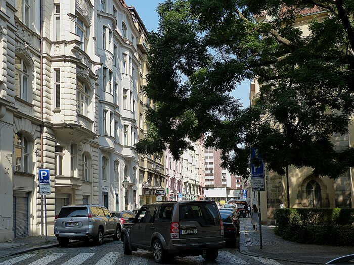
Prague
bathed in a September morning light gleamed with an endless variety of
ornimented building forms and textures. The old city road bed is paved
with
smooth rectangular stones which are constantly
slapped by tyres giving the city a unique sound. You always hear the
slapping tyres of an
approaching car which probably accounts for the lack of ear jarring car
horns weaving their way through clusters of sightseers pushed aside by
the sound.
 Sample of paving stones with tram (light rail) tracks. |
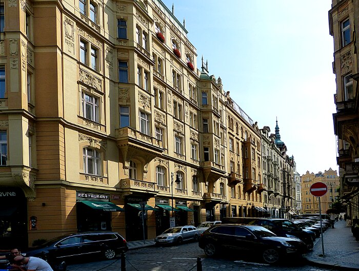 |
| Note
how the stone carved ornametation provides an interesting accent
to
the
building's flat surface walls. This flat type
sculpture is referred to as low relief. The use of flat and low relief
carved shapes can be used to describe the general style of a
building .
The third facing balcony projection from the left belongs to a separate
building. It's
ornimation is slightly different and projects over two floors not
three. Balcony
projections further down show a different ornamentation usage. The
overall
effect is a block of similar height buildings displaying variations in
eye candy which is the modern term for (ornamentation) eye attracting
textures. You could also describe these covered balconys as hanging on the building like grandmother clocks. Stylistic variation may be described in terms of shape size relationships between sculpted and non-sculpted flat surface shapes. At this stage I am avoiding the use of terms such as: Baroque, Rococo, Art Nouveau etc. which implies style components are unique. For example Romanesque Revival is mearly an older Romanesque style being applied to a different historical period but may contain stylistic elements from other periods. It is far better to understand period styles over time as a system of changing design relationships. Thus the influence of a design component from a Romanesque period may be recognized as being used in a modern period. Strip out all linguistic sophistication and we are reduced to designing with eye-candy but that description does not make us sound important. So we design with differently named eye-candies Romanesque candy, Baroque candy, Rococo candy and etc., candy. The combining of different period ornamental styles can be thought of as behaving like DNA in humans. Both parents contribute to the physical and mental uniqueness of the children. |
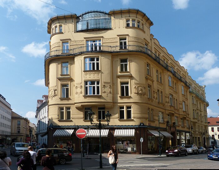 |
| The
corners of this
building are rounded although it has a less dense feel than the
preceding
building it does exhibit a kind of solidity. There are fewer individual
windows, balcony projections and low relief panels and more flat open
spaces which reduces the visual density. The iron-wire-like
material at the roof level and surround-railning adds an
interesting
delicate linear touch. The building expresses a great ship like quality
as though it
were
about to sail off at any moment. You can imagine the tug boats
pointing her towards the open seas . The sounds of horns and steam
whistles fill the air with warnings that you are in her way. For the
moment you feel like moveing aside watching as she slowly passes. |
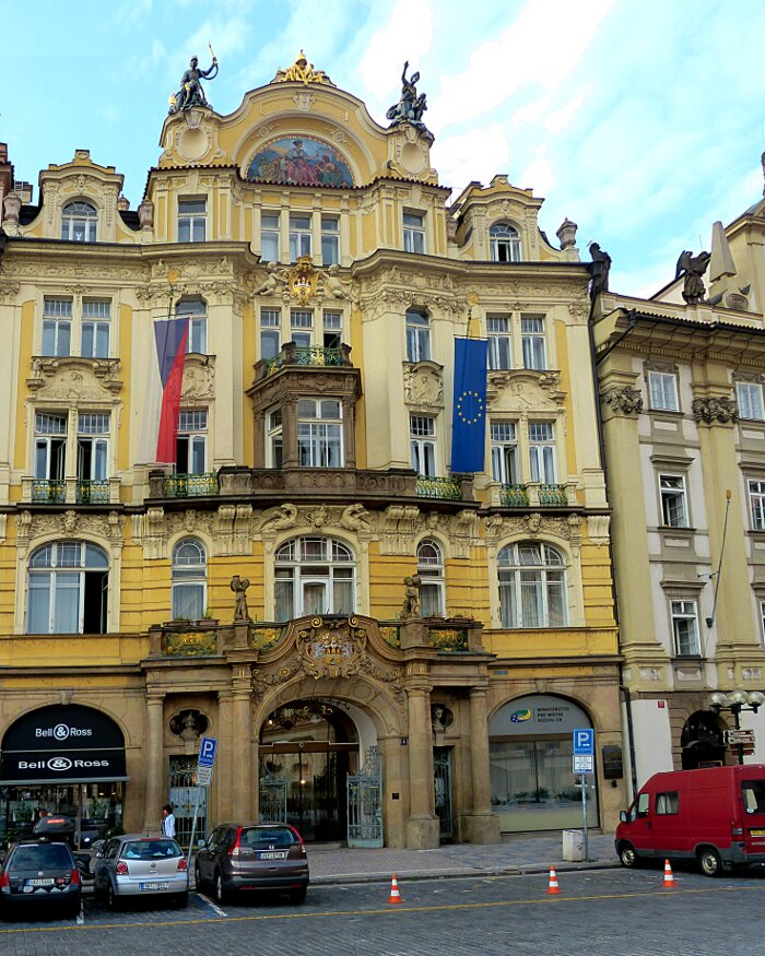 |
| This
building displays a catalogue of ornamental
expressions. Sculpted figures, high and
low relief sculpting, colour,
Greek temple columns etc. The light bounces from the sculpted edges like accents of fine lace on a silk dress. Add
a red carpet and two dormen.
Remove the cars, truck and commercial stores and then you have a fully
developed loveable neighbourhood character with her quirky look-at-wonderful-me style shown
to its best advantage. She is the self assured young flirtatious lady of the street with her miniature poodle out for her morning walk. |
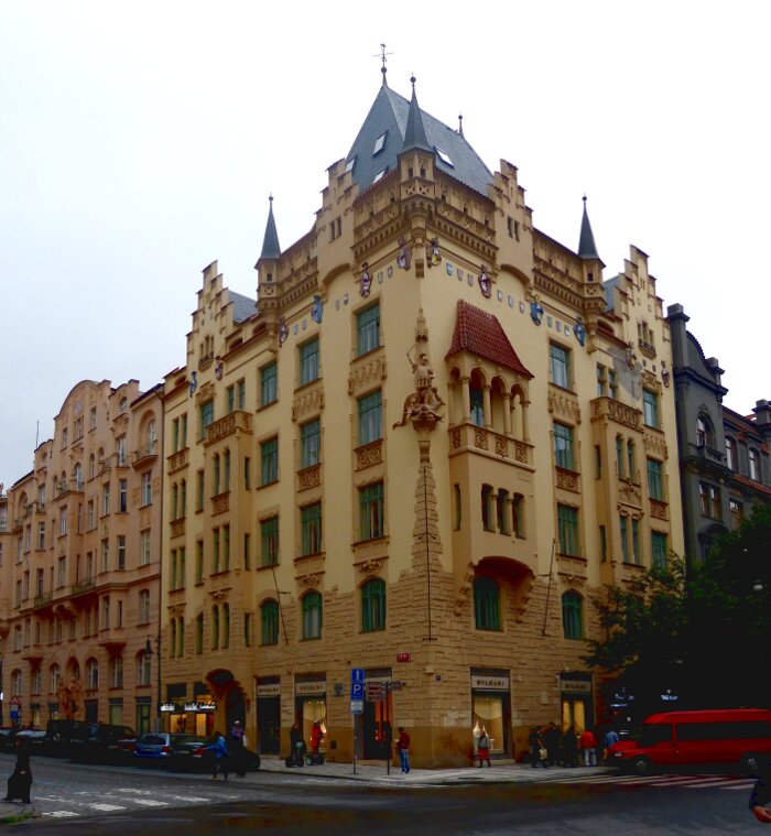 |
| The overall cream orange yellow with texture variation between lower rough and smooth upper is very effective in exciting the eye. The low relief scupted panels with window accents create a verticle flow from the first and second floor texture to the upper roof level ornamentation. The upper half of this building appeals to the eye with its shape variety culminating in the roof level. The street level appeal is a dissapointment. It is a majestic building worthy of viewing except for its mundane street level presence. |
|
|
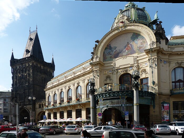
The
entrance center piece to this building draws attention to
itself much like the central subject of a portrait painting. The
left wing second floor Roman style arch windows visually connect with
the ground floor rectangular windows extending the vertical shapes up into the second
floor towards the roof line. This shape connection process may be referred to as
pick-up-shape(s) The curved
arch is repeated in the entrance piece and again in the curved roof of
both wings as another example of pick-up-shape relationships. Although the ornate
sculpture derives from earlier period designs , it ornates the green dome (which I have seen
in Germany) and use of linear
iron material gives it an overall style that uniquely belongs to
the
late 19th and early 20th centuries. A nice example of ornimation
elements functioning much like human DNA. Contrast this building with the blackish tower building on the left (although ornately sculpted) seems to symbolize darkness death and destruction. Both buildings combined express the dark and light side of human behaviour. That dark light relationship could change if the darker building were cleaned to reveal a lighter stone. |
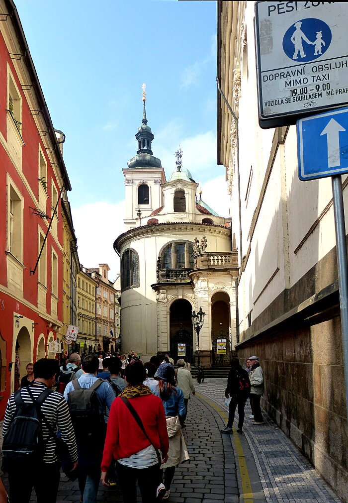 |
| Narrow
one-way streets, fill with tired, hungry and thirsty, wandering groups
of sight-seeing tourists seeking to explore the visually artistic
and culinary offerings of Prague. The culinary offerings we experienced
were of excellent quality. Remember to keep cash ready for payment as
credit-cards are not widely accepted. Note the interesting child care sign in the upper right. |
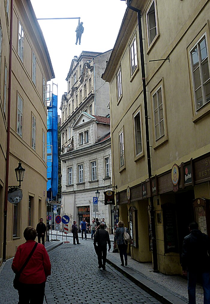 |
| "Man
Hanging Out" artist: David Cerny: 1996 : Fiberglass ( depicts Sigmund
Freud hanging by a hand and pondering whether to hold on or let go). My wife lower left in her red shirt has not yet
looked up towards the sky. Nor have the other pedestrian walkers looked
up. When in older city areas I always look up seeking to find interesting architectureal features. The authorities have received many emergency related calls concerning the hanging man which has been on display in many European cities. It is interesting to note that Freud as an elderly gentleman made his own decision as to when his life should end. |
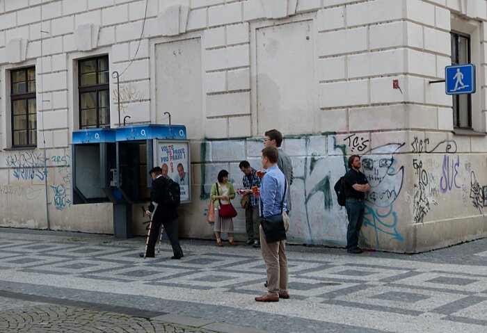 |
| It
seemed appropriate to follow the thought provoking sculpture of Freud
by this image of six people. The buildings street-level has been
defaced by very unskillful use of self centered adolescent type quick
tagging. A man on crutches moves intently in the direction of his
destination. A
group of two tourists look to their map for direction to their
next adventure. Two young men in office attire standing, looking
towards the direction
of oncoming transit. A bearded young male backpacker leaning against
the tagged wall looking into his personal imaginary world. The
building, eith adolescent tagging, cobbled sidewalk and road
describes the physical space which they occupy. But we all
live in mental space which may or maynot coinside with the same space
as physical space. |
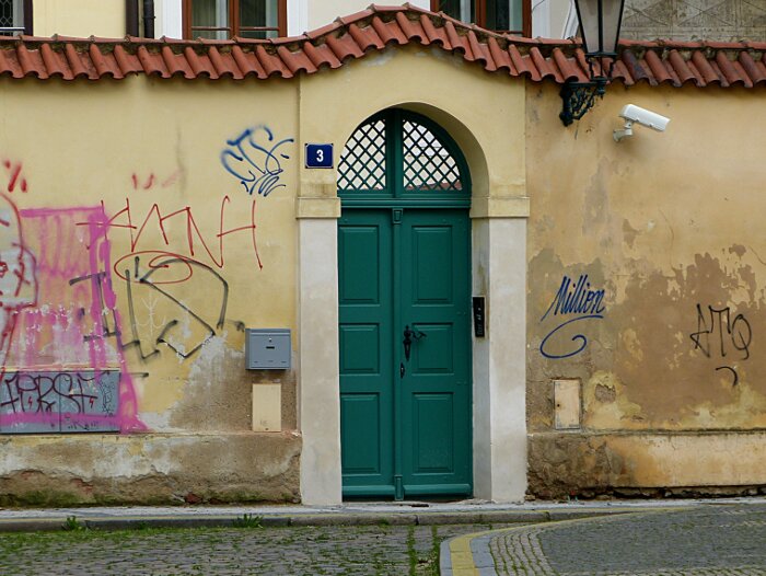 |
| I
find the vandalization of private property and public walls
interesting. It expresses a desire to be that is so strong it is
willing to destroy. It appears an attempt to clean up the wall had been
undertaken only to be rejected by the uncontrolable destructive urges
of the vandals. |
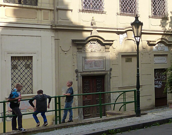 |
| Local
young boys hanging out. It may not be fair but we adult parents always
tend to wonder what young boys are planning for their entertainment.
Without adult advice there is always the problem of uncontrolled
unconscious urges bubbling to the surface. This thinking
reveals my bias towards ageism at the young end of the spectrum or is
it just my own experience. I had a great deal of adult interaction but
many kids of my childhood did not. |
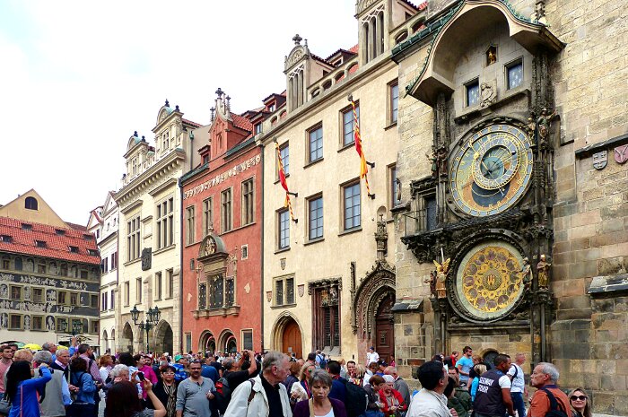 |
| Astronomical
Clock' on the side of the Old Town Hall Tower dates from 1410. Crowds of
tourists converge at the clocks base every hour during daylight to see
and be fasinated by the mechanical movement of figures on each side of
this ancient clock-face. For the past 600 years they have mechanically
danced at the hourly passage of time. The crowd senses themselves becoming
part of the figures as they dance towards their thousandth year.
The lower painted disk dates from 1866 providing a partner for the
clocks lonely journey of announcing the hours of time. A part of us struggles to supress our mortality and
this ancient clock sturs within our imaginations a sense of belonging
to something timeless. The clock symbolizes the rise of science. The second panel because of its religious content (names of saints for each day of the year) may have been intended to add a religous connotation to an otherwise famous non-religious icon. |
***16th Century Alchemist Workshop***
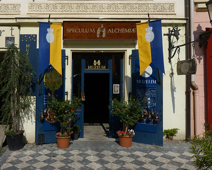 |
| This
small building containing a 500 year old secret was scheduled along
with buildings on each side to be demolished in 1900 but for
some unknown reason this one building survived. In 2002 a flood caused
the road in front of this building to form a sink-hole. The sink-hole
revealed one tunnel which was discovered to lead to the Old Town Square
and a second tunnel leading over three kilometers to the Palice.
Further investigation discovered an Alchemists labatory in original
condition sealed off under this building. Alchemists worked on trying
to discover a method for turning base metal into gold as well as
various healing elixirs. Alchemists worked in secret as they were condemed by the Catholic Church. The Catholic Church traditionally disaproved of all independent thinking. It is interesting that the store had been selling elixirs and herbs for many decades prior to the laboratories discovery and contines to do so. |
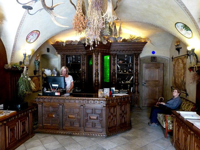 |
| Inside
the store / museum. Sharon is resting on the customer lounge waiting for
the tour guide to enter through the door marked above with a blue dot.
The back cabinet displays some of their herbal / elixir
offerings in addition to a selection of dried herbs such as those
hanging on the left and above. |
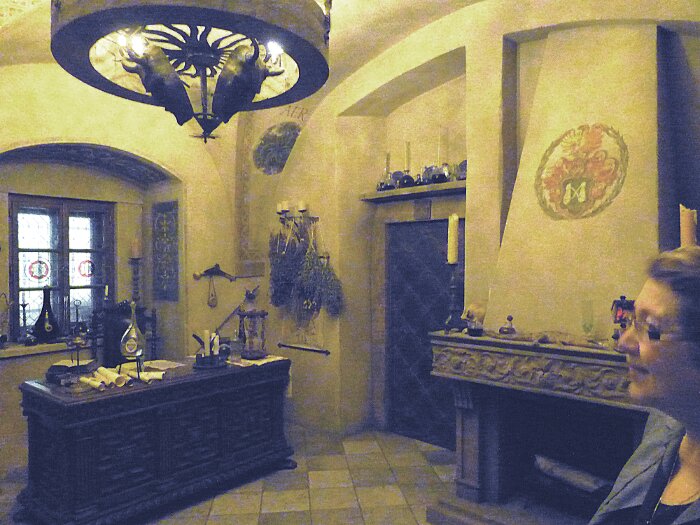 |
| The first room we entered after going through the door and down an old hall. It
appears to be some type of ancient study.
This photo was taken without a flash but provides an ancient gloomy mood which seemed to prevail. A bookcabinet covers the left wall as pictured in the following graphic: |
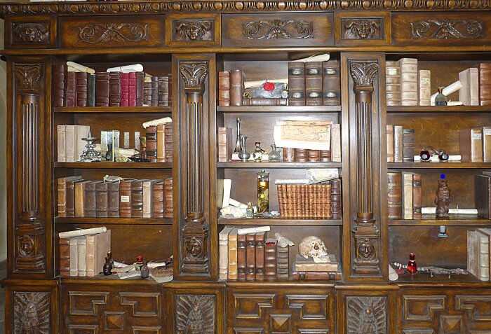 |
| The
original books and items have been moved to the Prague Museum and
replaced with simulations. Right column third shelf down sits a statue
with a blue dot above it. Grasp this statue in your hand then turn it
clockwise and a secret door opens. |
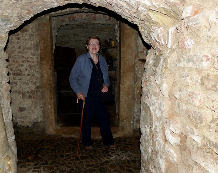 |
| I
took the opportunity to photograph Sharon. We haven't seen much of
Sharon in these pictures and they are supposed to also act as a record
of our trip. |
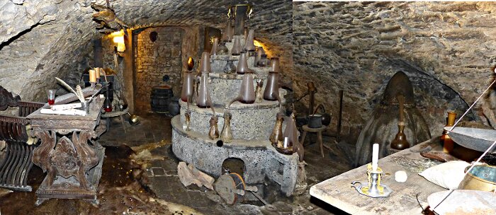 |
| One
of the Alchemist work shop rooms. Note the spiral table in which one
bottle is placed higher up to distribute substances to a lower bottle.
They hadn't yet developed more complex methods of distributing fluid and
gaseous material on a table top platform. My highschool chemistry
lab was more complex than this one. |
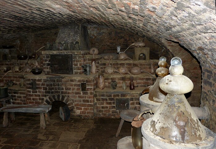 |
| Another
Alchemist work shop room. Note the strangly shaped glass bottels on the
right. Also notice the bird like bottels with their long beeks on the
brick sheves. |
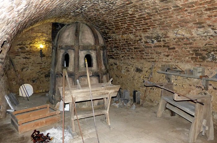 |
| Alchemists
had to work in secret and as a result they could not have their
specially shaped bottles made to size by just any glassblower so
they had there own secret furnice to fire the glass. Needless to say
there working environment was not up to modern code. |
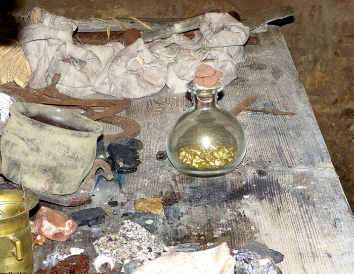 |
| Bits
of gold were found in a flask (these are replacements). No one is
certain as to their use. Alchemists worked in secret under patronage of
the rich. Their rich patrons wanted gold and health. Since the
Alchemists elixirs contained opioids and could provide wonderfully high feelings. So they survived
in secret to practice their secret craft of producing happy hours for
their patrons. Time to return to the outside world of Prague. |
***Back to the Street Life of Prague***
 |
|
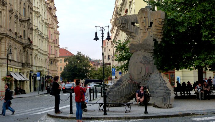
We have now returned to the world of Prague where I never expected to
see a sight like this. A man having his
picture taken while crouching between the giant birthing legs of a modernest public
sculpture of a knelling woman. His image is being captured by a
woman using cell-phone like camera. My photograph becoms a composed art work recording the real life kitch-performance-art. The couple on the extreme lower left walking accross the street ignoring the participants who are completely unaware of their role in becomming a dynamic extension of the art work and turning it into kitch-performance-art of which they are participants. The woman in the red sweater of the young male crouching between the nude's legs. That is one level. I see them taking a photo of their subject and that becomes a realistic level of kitch-performance-art. I decide take a picture of the picture takers taking a phicture of their subject interest and that becomes a third level photographic art. |
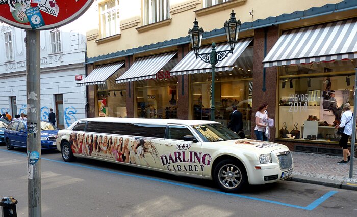 |
| The
only thing you risk is falling in love. It's a promo for
something called DARLING CABARET. Welcome to kitch. I personally
enjoy vignettes of real life kitch. Especially those which are
fleeting, hear now gone tomorrow. Seen among the artistic architecture
of Prague this stretch limo is a form of artistic kitch based performance art. No
less than the above image of the giant naked woman with little
courching man between her legs is an example of living artistic kitch. |
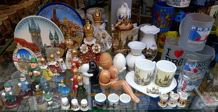 |
| The
girley salt-pepper holder, thimbuls, small tea mugs, large beer
mugs,picture plates, royality dolls, little short every-man dolls,
vases, bells: all tightly organized into mass produced kitch culture. |
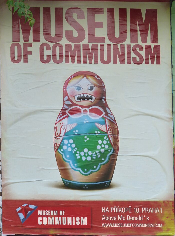 |
| Even
communism has become a form of kitch especially when the museum is
located above that great western cultural symbol " the golden
arches". Communism where everyone is equally poor except for a
privliged class forced by there role as state managers and leaders into
having to suffer the shame of wealth. |
|
|
|
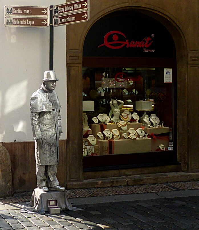
| Performance
Art (living sculpture). Good 19th century costume, pedistal nicely cloked and the donation
box is fitting. Standing beside a jewely store window adds a touch of
sophistication. The small porcelain nude in the window center adds an
interesting touch that moves the eye between the two lite tinted
humanesque figures. He has an interested looking at expression and the
small nude has a being looked at pose. This connection between himself
and the small nude may not have been part of his original intent but it
is part of the image content analysis. |
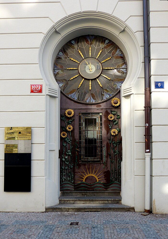 |
| I refer to this graphic as the Sunflower Door. We
have been exploring feminine content of image graphics. Some languages
in particular french assign containers a feminine designation. A spear
would be assigned a masculine attribute. There is an ancient language
structure that assignes either a feminine or masculine attribute to an
action. For example if your are waiting to catch a ball you are in
feminine or passive mode. If you are throwing the ball you are in
masculine or active mode. Sexual designations based upon body functions have been part of language as a form of trying to classify and add understaing to the world around us. The above sunflower door is referred to as a feminine symbol because it is an opening into a container. It is also in waiting for entrants or exits and is thus considered to be in passive mode. Humans function as organic connection making entities and tend to apply interpretations of their observatons in terms of previous connections such as their bodies. Note the star burst clock acting as the door's emotive climax. |
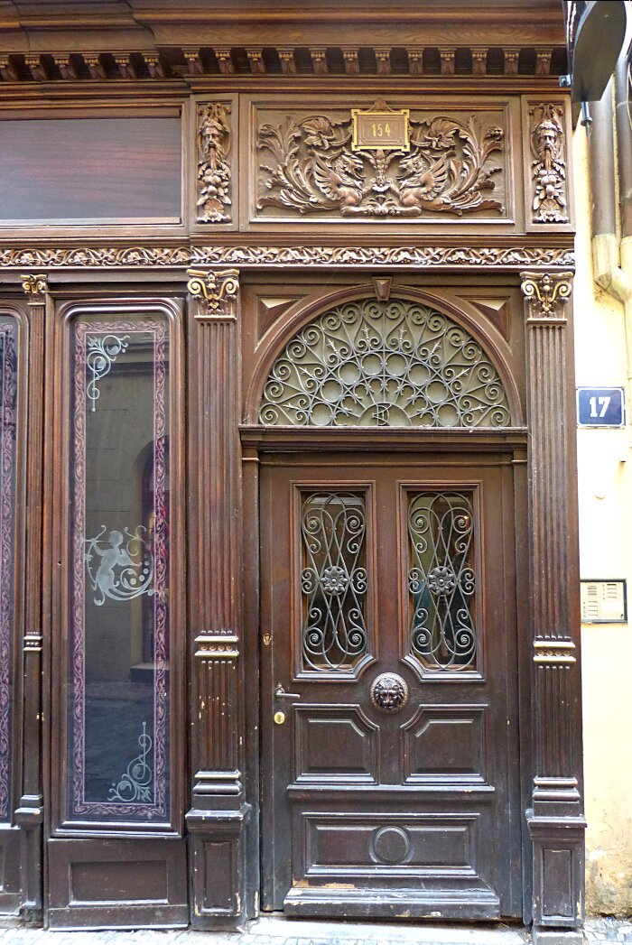 |
| This
may be an appropriate time to introduce an elaboratly carved street
entrance door which I found to be a most interesting example of low
relief carving. The arabesque (nicely curved) metal work integrates
very well with the carving. The arabesque style glass bordering etching
addes an additional transitional detail between the interior and
exterior of the window. The arabesque radial pattern above the door
functions like the star burst clock in the Sunflower Door above. Note
the small keystone occupying the upper position of the barrel curve. |
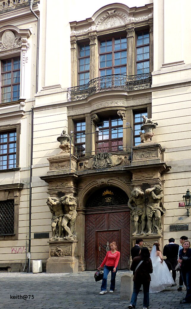 |
| This
door which seems to have drawn the attention of a wedding party is also
interesting but the abundance of and size of high relief sculpture used
gives the entrance a heavy quality that is interesting but overdone. It
is not a human scale welcoming entrance but a domineering threatening
entrance. Makes me wonder why it was selected as a backdrop for wedding
photographs. The woman in the red shirt just happens to be in my quick
shot graphic but she does add a touch of colour. Most of my
graphic shots are done quickly as sketches leaving the compositon
to computer tool processing. "keith@75" is added to the lower
left because the spot was empty and needed something. |
|
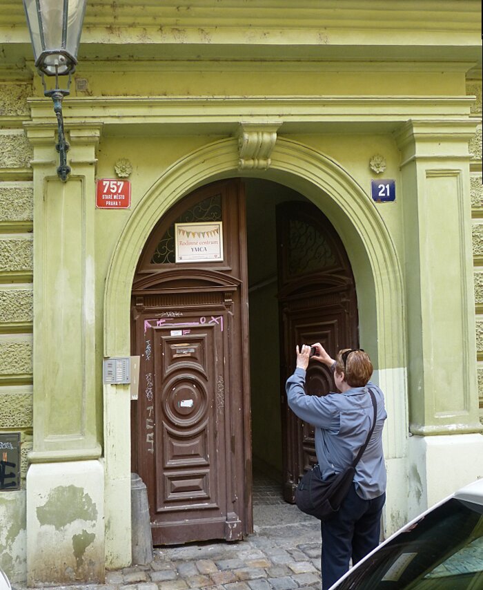
| Sharon
taking a photo of the "Y.M.C.A" hostel in Prague. Interesting how
the Romanesque curve of the door frame is reflected in the carved door
design which acts as a nice integrational feature. Note the keystone orniment which is often used with the barrel curve. |
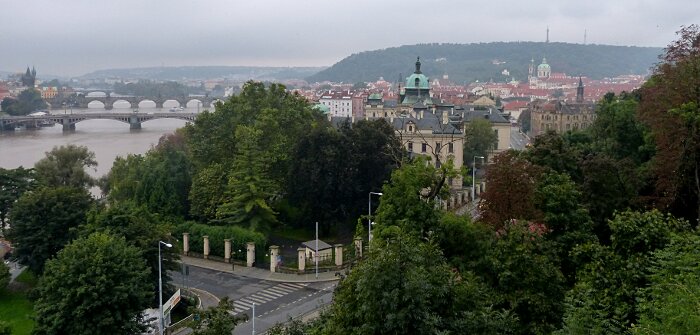 |
| On
our visit to Prague we were invited to join retired friends for dinner.
We decided to walk as our means of experiencing the city of Prague.
While walking up a steep tree lined path we found this opening
which provided a surprising view of the city
below. |
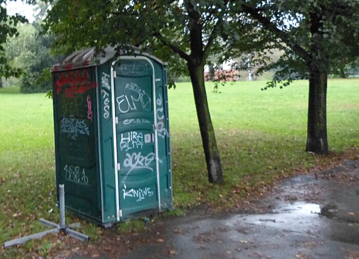 |
| Upon
reaching the hill top we walked though a park and was met by this
portable comfort closet. Its tagged appearance caused me to reflect
upon the idea that no
matter how much convenience and beauty we as a society provide in our
public
parks there is always an unplanned destructive contrabution. The
comfort closet stands there like a type
of performance art yelling its social comment: "Look at me, Look at me". |
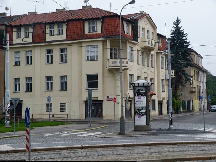 |
| This building just marks the end of the hill-top park where we found our frends street on the other side of the
tram tracks just where we had been told and within a few streets found
our friends home. We had a very pleasent social evening in Prague.
Leaving in darkness we took the tram down the hill over the bridge to
what we thought was the correct stop. We then proceded on foot to get
lost for over an hour walking in twisted circles eventually finding our
hotel which, we feel had unknowingly passed numerous times. |
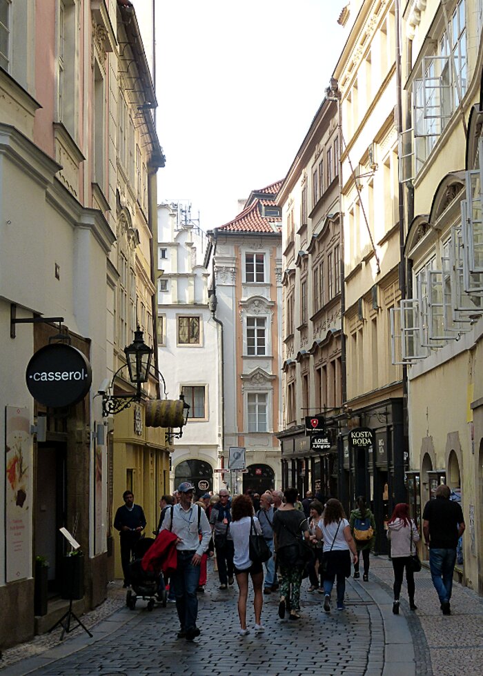 |
| The next day we continued our adventure walking the narrow winding streets of Prague in search of the Charles Bridge. |
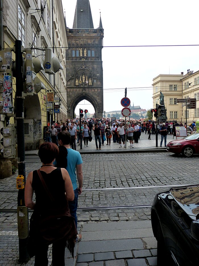 |
| We
are heading towards the Gothic style arch under that dark tower ahead that marks the Charles Bridge entrance.
The density of tourists is increasing as this is a must see attraction.
The road tram-tracks and sidewalk go through Romanisque arches on your
left. It is not unusual in Prague to see the traffic infrastructure
going through the ground floor of old buildings. It is difficult to
determine which was built first the building or the road. |
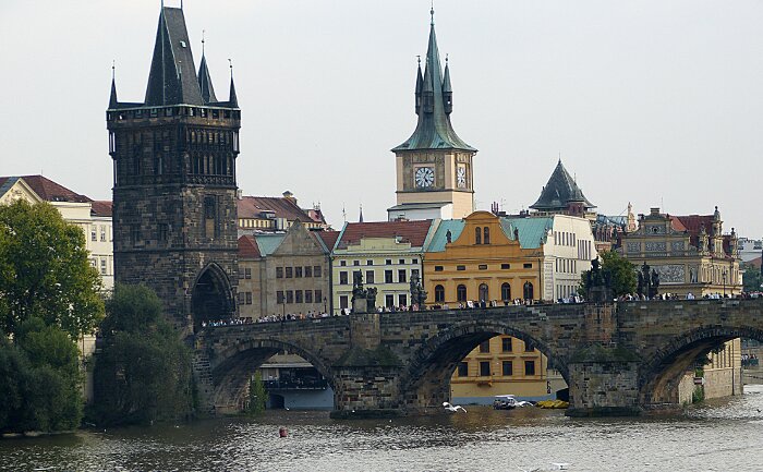 |
| A more comprehensive view of the Charles Bridge |
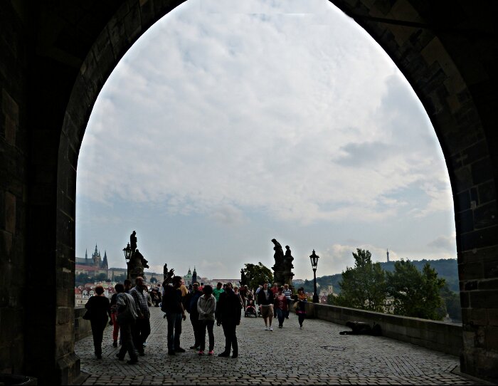 |
| We are
walking through the arches onto the Charles bridge. Those strange dark twisted lumpy
shapes near the bridge lamps are religous statues which we will view in more detail in the next photo. |
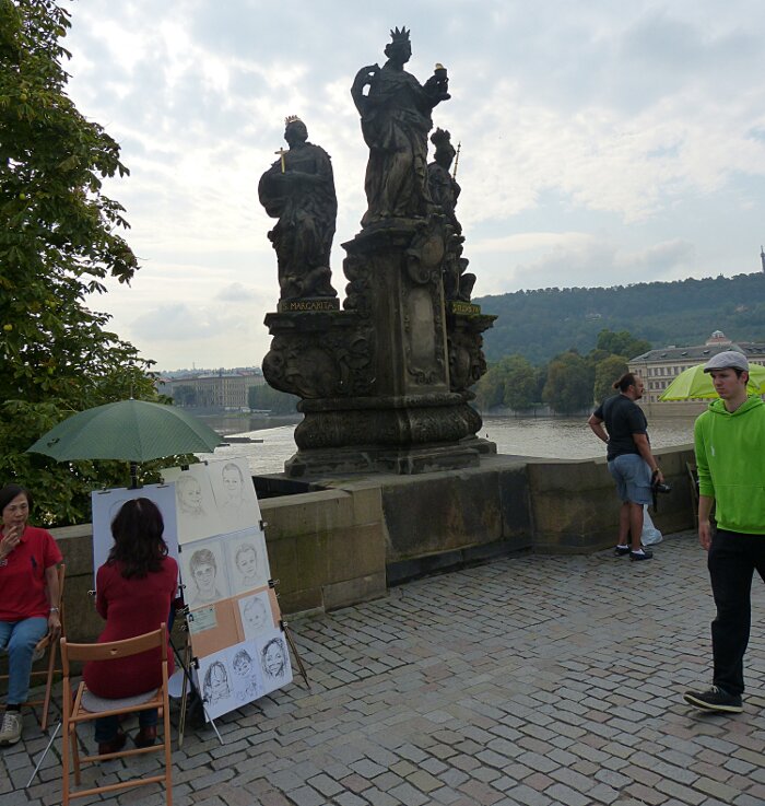 |
| It
is difficult for our modern minds to comprehend the impact that these
images had on the minds of less sophesticated people 500 years ago.
These images were more than just images they were sacred in themselves.
To have them used as attractions supplemented with activities such as:
have your picture drawn here or buy this jewlery or walk by without
making the sign of the cross on our forehead as you pass each image is
just beyond the undersatnding of an ancient mind. A mind that believes
God and his priests know your every secret thought. |
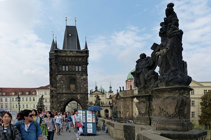 |
| Looking
back towards the tower we have a tourist on the left with his arm on
his girl and looking at one of the religous statues. A kiosk sales
stand and looking tourests form the modern context. I have been in
churchs that have to the modern eye become architectural and ornimental
attractions. Placing religous icons on an infrastructure bridge is an
attempt to turn a city into the interior of a church. The result in my
opinion is to overpromote religion to the point where religion becomes
a hollow shell of images without content. |
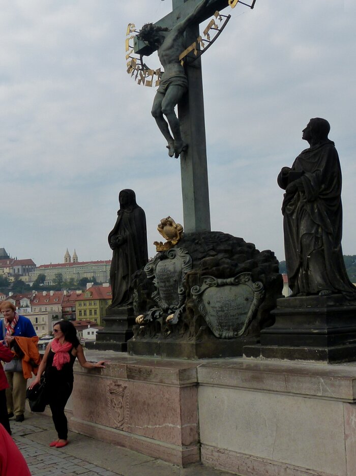 |
| She
is posing to have her picture taken with with the religous image. The
ancient Pagen Celts in Ireland would not display an image of Christ
hanging on the cross as they considered it too horrific. It raises the
question as to religion having gone too far in its incorporation of
horrific images used for religious teaching as to turn them into ornimants
without content. I don't think people can continuously look at horrific
images without becoming in some way desensitized as to their meaning. To
the woman having her picture taken the sculpture is just an empty image. As for myself my opinion is divided between by Catholic background which says that it is a sacred image that should some how be respected and my understanding that I have become tired of seeing religous deity images of suffering that I am supposed to meditate upon. I now think that, like her, should have had my picture taken as a form of rebellion against my brain washed half. |
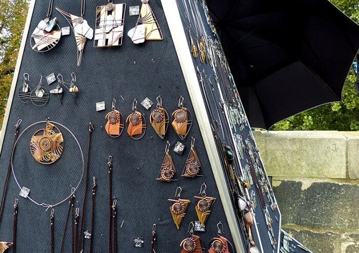 |
| The
use of linear designs and workmanship attracted our eyes so we
purchased a sample. It was sold to us by a young man careful not to put
weight on his right leg as he had broken his ankle playing soccer
six months prior. His parents made jewelry for sale at this
little stand on the Charles Bridge. |
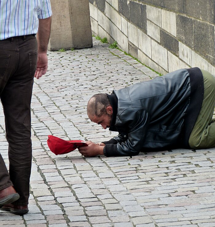 |
| This
image shocked my sensitivies. Having been in many cities: panhandlers
are a normal sight but not a sight like this. He is in a totally
subservient pose. He makes no eye contact. He asks for nothing. He is at
your feet allowing you to walk by without asking you to
acknowledge his existance. He symbolizes those disposable humans whom we do not wish to become aware and secretly fear becomming ourselves. His pose recalls the strong symbloic Christian ritual: 'The washing of the feet". His pose also symbolizes the bowing down before the diety or person who has power over your life and death. In modern artistic terms his pose can be interpreted as living sculpture: (art) also performance art: when viewed by a third person watching people either give him a coin or ignore him. The photographer becomes the recorder of the performance that involves him and another person(s). His jacket and pants appear new and clean. I would have advised him to wear a slightly more worn atire. He could have painted himself in silver or gold or both which would stress the living sculpture aspect of performance art. As one who begs he never has to look into the eyes of the giver or nongiver. Nor does the giver or nongiver look into his eyes. He becomes to himself an object. He does not see himself as a beggar who participates in the act of begging. His pride is protected by transforming himself into an object. |
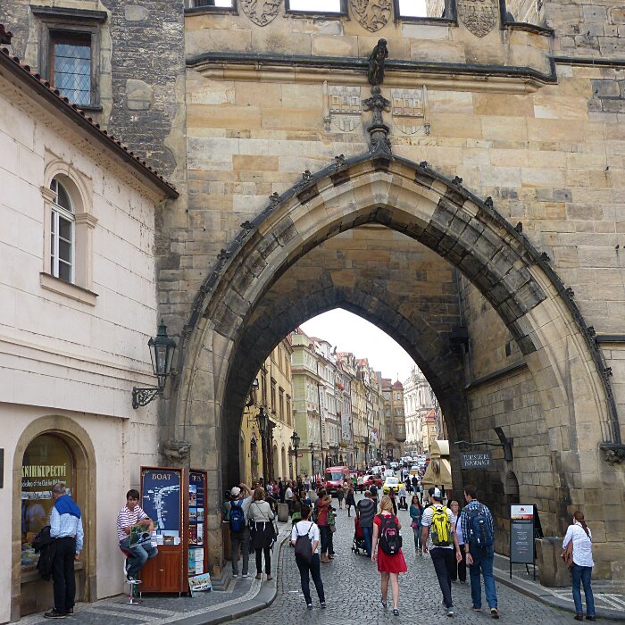 |
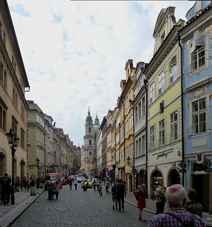
| Its
time to leave the Charles Bridge walking through the gothic arches and entering
another part of Prague. This image was cropped such that the girl in
the red dress would form a focal point between the man on the outer
left in the blue topped shirt and the girl in the outer right in the
white shirt. The distance between the lower bottom and the feet were
assessed for format tension as well as the upper top. The street
opening beyond the arches is an interesting compositional element of
colour and texture. |
 |
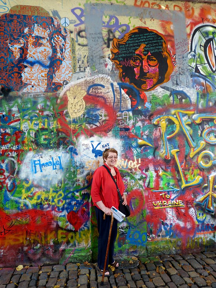
| We
have passed through the arches and I wanted to record the fact of
people and cars seem to regularly share the road way. The street scene
makes an interesting composition with out being seen through the Gothic
arches. My camera causes perspective distortion of the buildings so I
have to adjust the perspective distortion in my computer to provide a
more natural scene. |
***A Sudden Change in the Image Colours***
 |
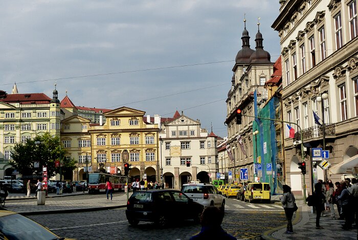
| It
seems strange suddenly arriving at this colourful image but my
wife pulled me down a side street saying: "it's here - it's here". She
had found the Lennon wall that she had been looking for. There were
more than a dozen people posing, photographing each other in front of
the wall. The wall in its surroundings was pure kitch as if a
multi-coloured blob had suddenly splached from the sky. It was
spontanious people expression bubbling up from their unconscious
finding release through paint on a wall. It is the hidden soul of
Prague youth screaming the presence of their existance. The Story of the Wall's Origin: "On the death of John Lennon, youths of Prague decided to have a symbolic burial place for a man they admired for his fight for equality and peace and freedom for all. The site of this burial place became the John Lennon wall. Youths expressed their grievances with the regime by writing them on the wall in the dead of night as they faced a prison sentence on being caught. These days nothing of the original messages and graffiti remain after a reconstruction by the owners of the wall, the Knights of the Maltese Cross,
but it still remains a strong symbol of the fight against oppression
and freedom of speech. The wall has again over time become covered with
grafitti in the spirit of love, peace and freedom and is a huge
attraction for visitors to Prague." source: https://www.1pragueguide.com/john-lennon-wall |
***Back to Normal Colours***
 |
| Back
to wandering the streets of Prague in search of interesting
relationships betwee architecture and people. We are now looking for Wenceslas Square. |
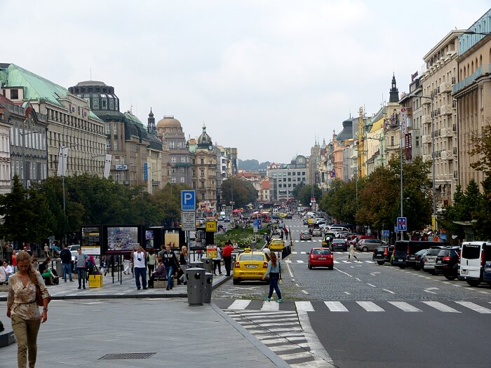 |
| We
twice walked the 680 meter length of Wenceslas Square (Boulveard) to the statue end (shown next graphic) . It
is the least intimate part of Prague. There are some interesting
architectural details but it is primarily a contemporary european
boulveard. It does bring you back from the Prague of old to the
contemporary Prague . The commercial
atmosphere of the boulveard with the local woman in the lower left
corner could be a scene in Paris, London, Berlin, New York. |
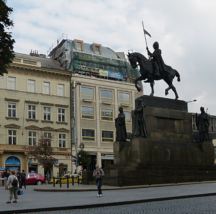 |
| The
early 20th centry statue of St. Wenceslas marks one end of the
680 meter by 60 meter boulevard. The
equesterian statue is a very formal dark and
gloomy composition expressing a divine source of authority through St.
Wenceslas down to imposing obedience to authority delegated to
priests.
The image creates a contrast between: "life must be taken seriously for
salvation is in death" and " surly life must have a little fun". |
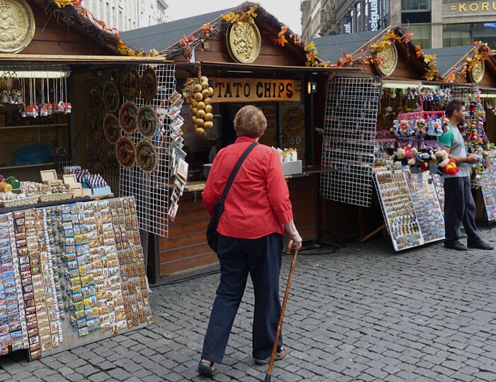 |
| The fun end of Wenceslas Boulevard. If history is a teacher then we should wounder when the human dark side will rise again. |
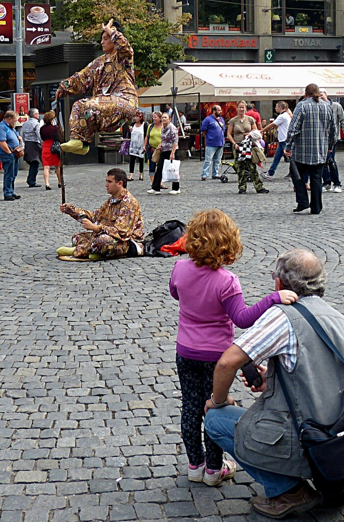 |
| It
has a street circus quality that can be found in many great cities of
the Western World. People are always facinated by living sculpture and
this little girl and her father are no exception. I have often wondered
of the meditation capabilities shown by these posed people. Definitely
not addicted to their cell phone texting. |
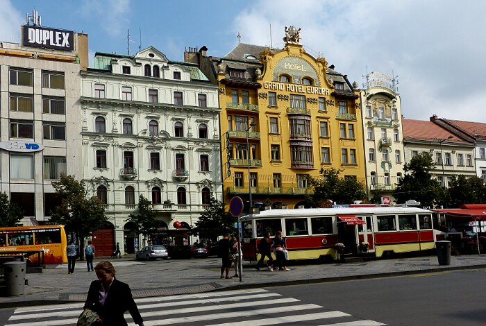 |
| Buildings on the side of Wenceslas Boulevard. The Grand Hotel Europa: is one of the more interesting buildings with its colour and ornimation variety and its orchestration of Baroque. Rococo, Nouveau and Deco styles. The ornimation does not quite cover up its planeness. |
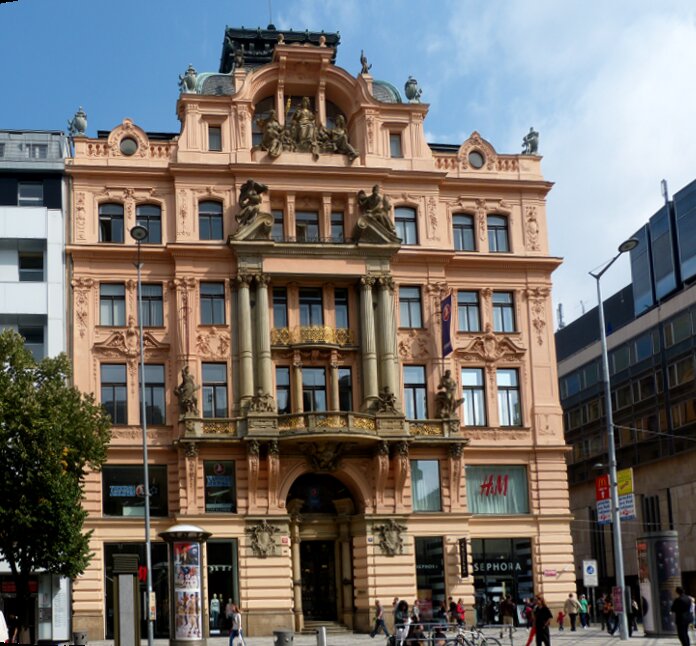 |
| This
building has some ornimental interest mainly because of its rounded
colums,
curve useage and full figures but with a heavyness that
seems to over burden its mass causing the ornimation to
border on falling down. The support brackets for the third floor
balcony should have been kept dark to continue the flow and not
coloured pinkish. |
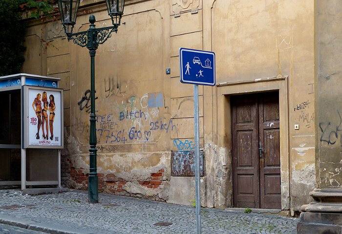 |
| This side street allows me to enjoy exploring contrasts. The erotic poster contrasts one life style
of pleasure and cleanliness while the reality of its surroundings
projects an opposite lifestyle. The poster is of another world a
more appealing world to the one it is in. Which world would you
choose? |
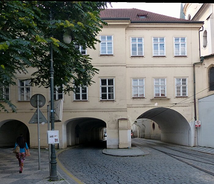 |
| This
is a interesting example of utilizing limited city space. We see the
walkway, road and tram tracks on what would normally be the ground
floor of a building. |
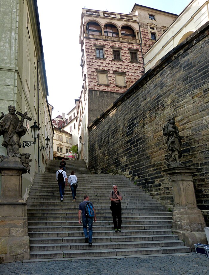 |
| Another
example of contrasts. Religous Sculptures intended to turn the city
into a church become outdated objects. A church is a sacred meeting
place and not a place of commerce. |
|
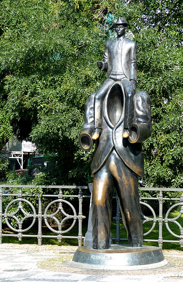
| Franze Kafka: Born in Prague. You may find this statue a strange surrealistic representation of a 20th century writer but Kafka explored concepts of alienation. You may search Wikipedia for more information. |
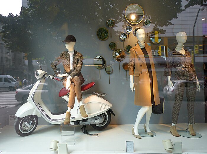 |
| Once
more my interest in contrasts captures my eye. The modern world
of Prague is illustrated in this life style display window which also reflects
street images. The manikin on the right is ackwardly posed which
presents a discordant contrast within the window. Much like modern Prague with its spectrum of old and new. |
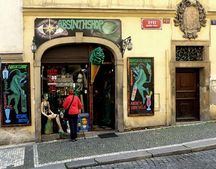 |
| Wonder
what Sharon will find in this store. If I were smart I would get an ice
cream cone but I wasn't smart. Note the oversized ornate scroll over
the small door on the right makes the door look smaller. |
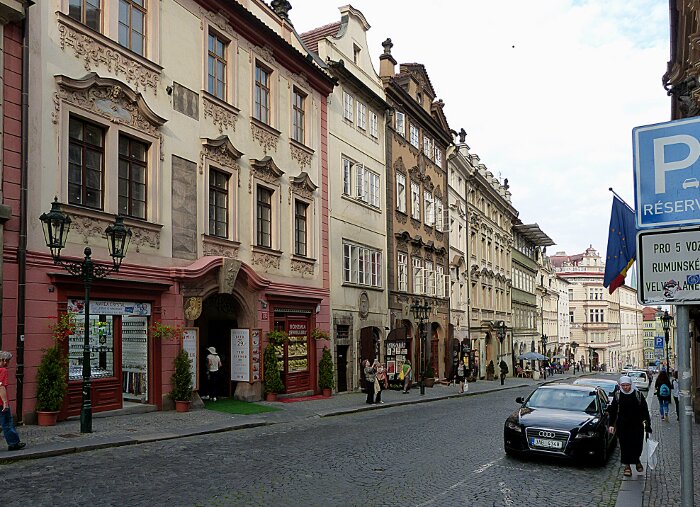 |
| Time
for a typical Prague street scene. Its a lane wider than many of the streets
we have been on. Note the ornimation variety in above and
the below the groups of windows . |
|
| We
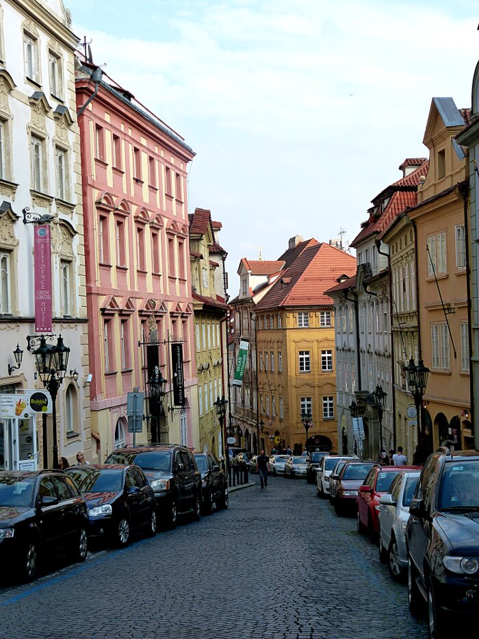
walked up this hill on our way to the castle. Interesting colour and
texture variety among the building blocks. Clean shinny modern cars
line the streets |
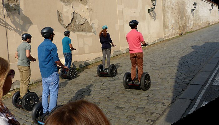 |
| Some
modern tourists prefer a different mode of personal transportation. Its
almost as though small groups of people that look like us suddenly appear from an alternate
dimension. Their lack of physical
animation and all staring in one direction as they move
allows them to occupy a real life surrealistic dream sequence from a Kafka's imagination. They add to the real life collective of performance artists through out the city. |
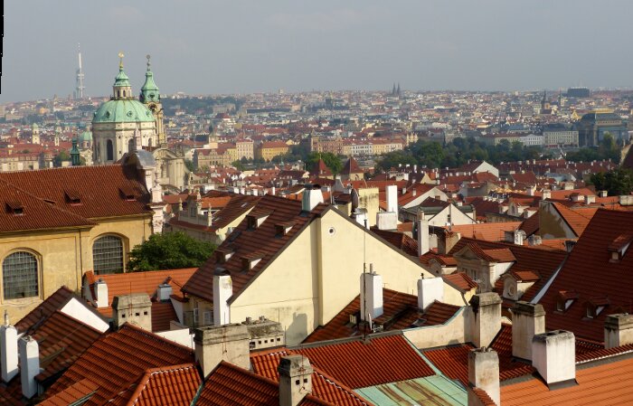 |
| Just before we reached the hill top we stopped to look at this view of Prague. |
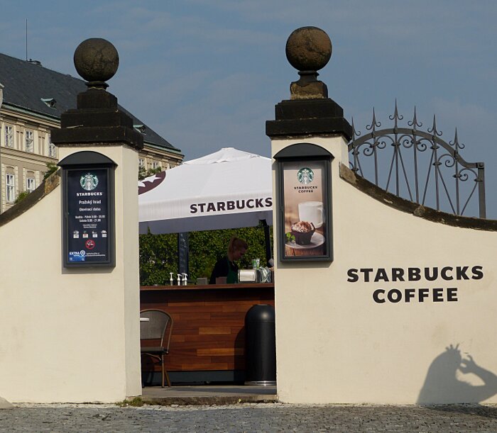 |
| This
is not a fake, this is real. As we got nearer to the hill top location of the
Castle, we looked up and saw "Starbucks". In the left upper corner you
can see a Castle building section. The Castle is a major tourist attraction
so why not sell coffee etc to we tired Castle seeking hill
treckers. |
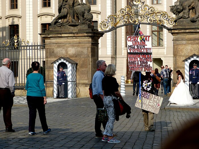 |
| Yes
this is real: a lonely Prague protester doing his protesting in front
of the Castle. What ever he is protesting it
has something to do with 1869. A number of circular pins on his shirt
gives him a quirky appearance. I don't think he would consider himself
part of a performance art system of the city but people do seem to be amused by him. Also note the bride on the left side moving towards the
entrance to pose for her wedding picture. Interestingly our protester, bride, groom, photographer and both Castle guards form a group of performers with the Castle visitors as their audience. |
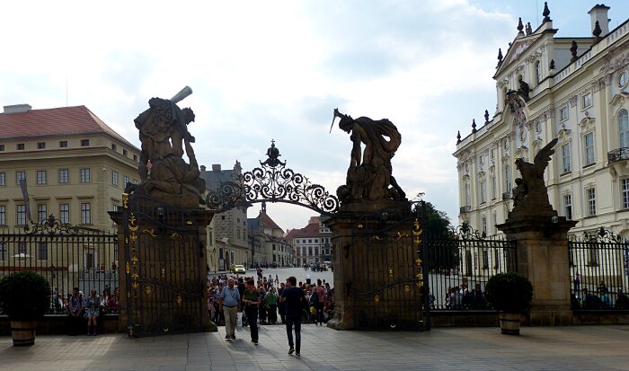 |
| This view is from inside
the Palice gate looking out. It is interesting that the sculpture on
the right gate gate pillar clearly portays the violent act of killing. The
sculpture on the left gate pillar portrays no less a violent act. The Castle
gate and buildings exhibit both great beauty and great anger , both qualities that run
deep within each of us. |
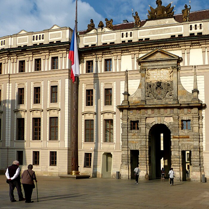 |
| The
first notable contrast is between the Gateway Entrance and the
surrounding architectureal style. The entrance was constructed in
the 1614. The surrounding architectureal style
dates from the 18th century. The overall effect gives the Gateway
Entrance a stone fireplace like quality. The Castle origins
date from the 11th century and has experienced cycles of
destruction and reconstruction which accounts for its unique mixture of
historical styles. |
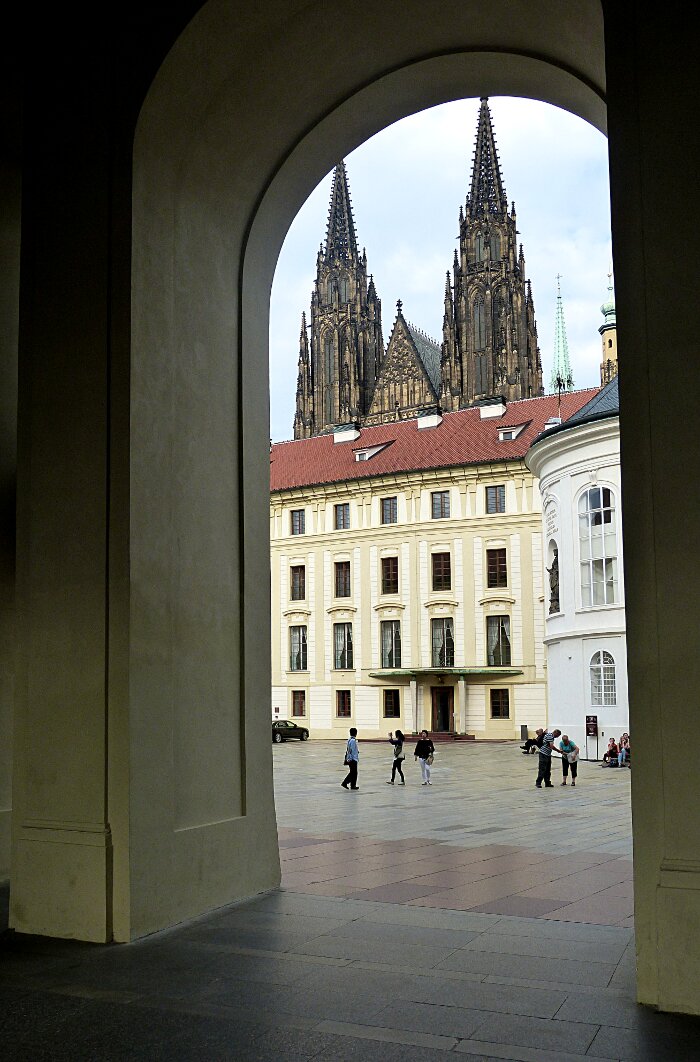 |
| As
we walk through the Gateway entrance we see a pair of Cathedral like
steeples rise above the courtyard buildings. I had
never heard of a private Cathedral inside a Palice. The front entrance
greets me with statues of humans killing humans and the interior of
the Castle surrounds a Cathedral representing human salvation. It
is an incredable contrast but a human one. We are both. |
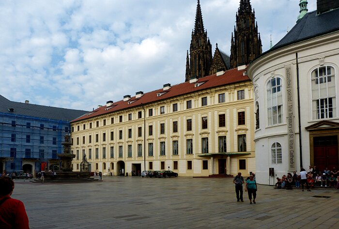 |
| The
left hand side court yard showing the dark Cathedral Steeples . The
architecture except for the Cathedral is light and airy but not that
exciting. |
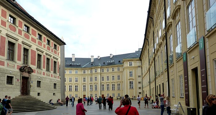 |
| The right hand side court yard view from the entrance. As previously stated the buildings are not that exciting to the eye. |
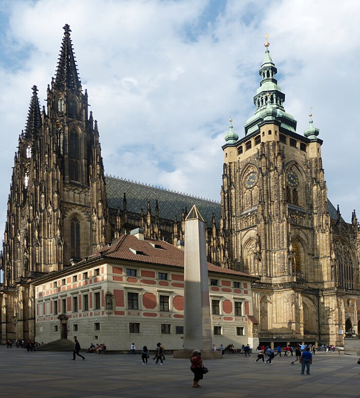 |
| The
Gothic Cathedral inside the Castle. The earlest chirch was founded in
926. This building was begun circa 1340 and underwent modifications
over time. Note the Gothic highly textured surface ornimation with a
vertical orientation contrasted against the coloured flatish ornimated
building. |
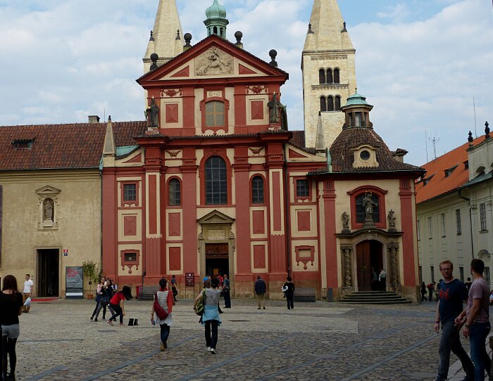 |
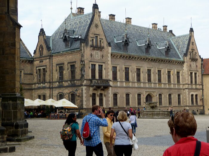
| Walking
round inside the courtyard. The ornimation on this building is more
flatish with sculptured accents around doors and roof. |
 |
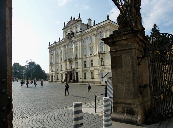
| Walking
around the courtyard we see another archictural style using sharp
triangular shapes to produce an upward eye movement to the building. |
 |
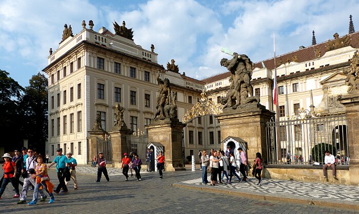
| Leaving
the Castle we see an outside the gate building with a gracefull
archictural style combining the light coloured flatish forms with
the more sculpted forms. |
 |
| Its time to say good by to the Prague Castle. |
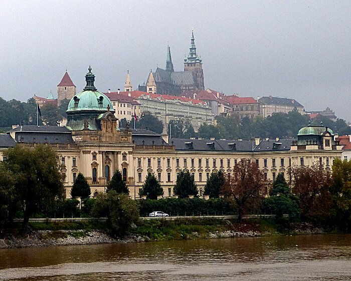 |
| Our last look at Prague Castle from across the river with its Gothic Cathedral steeples rising high into the sky. |
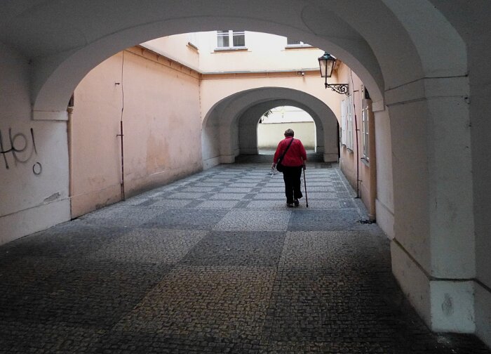 |
| There are a number of these wonderful ground level paths between streets. |
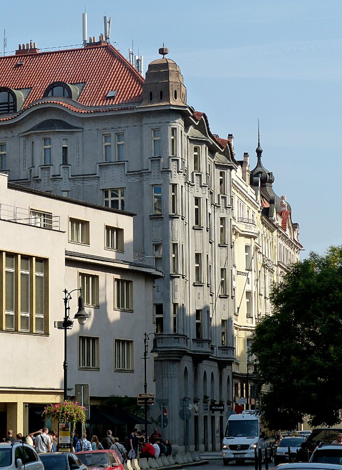 |
| Look at the building with the red roof. It has a 20th century Art
Deco feel because of the ornimentation but the vertical motif gives it
a Gothic tone without the typical Gothic arches. The
barrel arches on the second floor extend down to the first floor entrances providing a
vertically interesting street level upward movement. Compare the
vertical line motif with the vertical line motif of the Gothic
Cathedral in the Castle to obtain an historical reference. The roof
style forms a cap absorbing the vertical thrusts from racing into the
sky. The buildings to the left attempt a vertical movement by subdividing their windows into narrow rectangles but the surrounding blank space defines the window opening addng no vertical movement above below and around the windows. The windows express no movement they just sit in place. The street level entrances provide no upward movement. It is a good example of a boring building. |
 |
| Our
hotel. "MAXIMILIAN". One of the most tourist friendly hotels we have
encountered. Clean modern interior, guest lounge with free coffee. An
excellent take out pastery shop around the corner. Bring some pastery back for a relaxing end of
day moment in the guest lounge. |
 THE END |
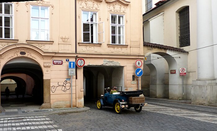
| This
was a lucky shot so I chose it for the last graphic. We have a path-way
on the left a car road in center and a tram rail system on the right. |
| EPILOGUE |
| All
photographs were taken as quick sketches in 10mp. They were intended to
be composed by croping and manipulation within a graphic editing
programe. Once composed they were then analysed in terms of artistic,
cultural, historical and contemporary content which was then expressed
in textual terms. The images and text interact with each other forming
a type of graphic essay. |