| |
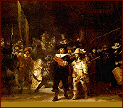
* Note: Rembrandt graphic
above: 200 years ago the bottom section of this painting was cut off
to make it fit a wall - I have added a band to simulate the original
composition proportions.
Principle no. 1
To be a creative artist is to understand the language of art such
that you can shape it to express your feelings through artistic thoughts.
Principle no. 2
The language of art is not a scientifically
accurate language. The language of art is based upon the application
of tendencies and as such creates more variety of interpretation between
people than absolute agreement between people.
If you have not read the
supplementary material on Pre-classical and Classical tendencies:
click here to do so
Pictorial unity became the main objective of painting during the 16th
century. The new vision united all the painting's shapes and textures
that were competing for attention into a unified whole and at the
same time allowed them to retain their individuality.
In previous centuries individuals and groups were composed into planes
but they were disconnected. And did not form any coordinated recessional
movement within the pictorial space. The creation of overlapping planes
for the foreground, middle-ground, and background (FMB) that created
a more naturalistic recessional space.
Some paintings had been designed to be read in bands from bottom to
top (earth to heaven or heaven to earth) such the FMB was flattened
to the picture plane. Another style dictated the painting was read
in terms of overlapping bands that gave the illusion of moving into
the picture in a more life like naturalistic fashion. This system
required all human and non-human objects in the painting to be scaled
in proportional size to reflect a more natural relationship to the
real world.
It is worth noting that these changes in western art occurred in conjunction
with the alphabetization of the western world. Ideas about people
and things were no longer ranked in terms of there emotional value
but in relation to their position in the alphabet - e.g. cows and
horses were now listed before kings this was most upsetting to kings
who were also having to put up with artists wanting to make the king
more normal sized and priests who had to agree that god could be scaled
to a more life size.
So the multiplicity problem became one of placing important figures
in prime locations within the pictorial field - much like arranging
actors on a stage.
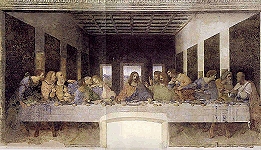
We use Leonardo's Last Supper as a sample starting point for our base
style category titled Classical. Other names have been used to identify
this style: e.g. intellectual, solid, solar - meaning daylight that
exposes every part of a scene.
The light is evenly distributed over forms that are equally modeled.
Facial expressions contribute to the emotional content. The figures
sitting behind the long table form a plane and the figure of Christ
is centralized - given slightly different clothing colours and is
isolated to a degree. All the shapes are delineated by an edge or
contour and the main shading used is known as edge shading. There
are no dark shadow areas containing objects which require a concentrated
effort to determine their identity.
To sum up: we have defined classical art as using 1) clear outlines,
2) edge shading, 3) equalized distribution of light, 4) shadow that
describes the shape of the form, 5) the ability of the viewer to imagine
a finger moving around and over every part of the form. 6) light and
shadow are completely attached to the form in aiding its description,
7) shadow areas do not conceal all or part of their contents, 8) there
is a precision quality to our classical approach.
The 17th century gave birth to a new vision and to illustrate this
vision we will use Rembrandt's Night Watch to illustrate our second
style category titled Baroque. It should be noted that about 200 years
ago 12inches was cut off the bottom of this painting in order for
it to fit a wall - thus compromising its original composition.
The classical style allowed everyone's facial features to be given
equal likeness in a group portrait and positions of importance were
assigned to people of importance. The new style was more concerned
with the play of light on objects than the identity of individual
people. That meant some objects would get more light than others.
Parts of those other objects may be completely obscured by shadow
and not be easily identifiable.
Light and shadow are detached from clearly defining the identity of
objects and become design features used to express overall movement.
It is a nocturnal style as opposed to a daylight style. A style of
subordination, mystery and change as opposed to the classical style
of revelation exposure and timelessness.
To sum up we define baroque art as: 1) eliminating parts of the contour
such that the object is no longer completely defined by a contour
line - this results in the eye moving over the surface of objects,
2) pictorial space is organized into recessional planes that merge
as they move into the distance, 3) light is used to as design and
not specifically to identify objects, 4) shadows partially and sometimes
completely obscure objects, 5) there is what classicists consider
an imprecise sloppy quality to our baroque approach.
When dealing with our two basic styles we must keep in mind the dynamic
duality of the style concepts that make up these two basic styles;
1) linear to painterly;
2) plane to recession;
3) closed to open space;
4) multiplicity to subordination;
5) clarity to realitive clarity;
Remember to always think in terms of the mixtures between the two
concepts within each style catagory. Style catagories are mixtures
much like the grey scale between black and white or the range of colors
obtained by the mixtures of yellow and blue - much like the moving
graphic above. With this shifting idea in mind we begin our separate
analysis of the five style catagories.
...................
...web introduction to be continued...mean while see my current lecture
notes below...
......................................................
|
|
