|
The Role of Hierarchy in Composition
Session 4: from multiplicity to subordination
4.1 General
The main idea to remember is that pictorial unity became the
main objective of painting during the 16th century. The new
vision united all the painting's shapes and textures that were
competing for attention into a unified whole and at the same
time allow them to retain their individuality.
In previous centuries individuals and groups were composed into
planes but they were disconnected and did not form any coordinated
recessional movement within the pictorial space. The creation
of overlapping planes for the foreground, middle-ground, and
background (FMB) that created a more naturalistic recessional
space.
Some paintings had been designed to be read in bands from bottom
to top (earth to heaven or heaven to earth) such the FMB was
flattened to the picture plane. Another style dictated the painting
was read in terms of overlapping bands that gave the illusion
of moving into the picture in a more life like naturalistic
fashion. This system required all human and non-human objects
in the painting to be scaled in proportional size to reflect
a more natural relationship to the real world. It is worth noting
that these changes in western art occurred in conjunction with
the alphabetization of the western world. Ideas about people
and things were no longer ranked in terms of there emotional
value but in relation to their position in the alphabet - e.g.
cows and horses were now listed before kings this was most upsetting
to kings who were also having to put up with artists wanting
to make the king more normal sized and priests who had to agree
that god could be scaled to a more life size.
So the multiplicity problem became one of placing important
figures in prime locations within the pictorial field - much
like arranging actors on a stage - but still maintaining overall
unity.
4.2 Unity through Multiplicity: We use Leonardo's Last Supper
as a sample starting point for our base style category titled
Classical. Other names have been used to identify this style:
e.g.intellectual, solid, solar - meaning daylight that exposes
every part of a scene.
The light is evenly distributed over forms that are equally
modeled. Facial expressions contribute to the emotional content.
The figures sitting behind the long table form a plane and the
figure of Christ is centralized - given slightly different clothing
colours and is isolated to a degree. All the shapes are delineated
by an edge or contour and the main shading used is known as
edge shading. There are no dark shadow areas containing objects
which require a concentrated effort to determine their identity.
To sum up: we have defined classical art as using 1) clear outlines,
2) edge shading, 3) equalized distribution of light, 4) shadow
that describes the shape of the form, 5) the ability of the
viewer to imagine a finger moving around and over every part
of the form. 6) light and shadow are completely attached to
the form in aiding its description, 7) shadow areas do not conceal
all or part of their contents, 8) there is a precision quality
to our classical approach.
4.3 Unity through subordination The 17th century gave birth
to a new vision and to illustrate this vision we will use Rembrandt's
Night Watch to illustrate our second style category titled Baroque.
It should be noted that about 200 years ago 12inches was cut
off the bottom of this painting in order for it to fit a wall
- thus compromising its original composition.
The classical style allowed everyone's facial features to be
given equal likeness in a group portrait and positions of importance
were assigned to people of importance. The new style was more
concerned with the play of light on objects than the identity
of individual people. That meant some objects would get more
light than others. Parts of those other objects may be completely
obscured by shadow and not be easily identifiable.
Light and shadow are detached from clearly defining the identity
of objects and become design features used to express overall
movement. It is a nocturnal style as opposed to a daylight style.
A style of subordination mystery and change as opposed to the
classical style of revelation exposure and timelessness.
To sum up we define baroque art as: 1) eliminating parts of
the contour such that the object is no longer completely defined
by a contour line - this results in the eye moving over the
surface of objects, 2) pictorial space is organized into recessional
planes that merge as they move into the distance, 3) light is
used to as design and not specifically to identify objects,
4) shadows partially and sometimes completelyobscure objects,
5) there is what classicists consider an imprecise sloppy quality
to our baroque approach.
We have previously studied this
under the titles :focal point, center of interest, a-chromatic
center ( maximum small area of light and dark contrast) , chromatic
center ( maximum small area of pure intense colour contrast).
All of which because of contrast attract's the eye to a shape
or the intersection of shapes.
We have also previously studied the application of different
intensities to foreground (strongest) , middle-ground (more
neutral) and back-ground, (weakest) as a means of organizing
eye movement within the pictorial space.
As you can see the word hierarchy or pyramid either of which
would be more appropriate in describing this concept.
A more detailed description which relates to our previous studies
in creating pictorial depth through the unity or pyramid approach
is provided for your review as follows:
The more you decrease the intensity of
the middle-ground plane in relation to the foreground plane
and decrease the intensity of the background plane in relation
to the middle ground plane you are creating a hierarchy of differences
between the planes. The more intense planes attract the eye
more than the less intense planes. This creates a centralized
focal area with the other areas being made subordinate or having
less eye attraction strength. All the subordinated planes work
together with the dominate plane to form a whole.
4.4 Examples:
4.4.1 Example of Unity by Multiplicity (matrix)
We will view the graphic on page 10 of our reference book: "Thoughts
on the North" by Bruno Cote
I would evaluate this painting as having
a design bias towards unity by multiplicity. Normally we would
look for clarity of objects in the foreground and equal clarity
of objects in the background to determine a multiplicity style.
If we consider brush strokes as objects then the foreground
brush strokes used to describe rocks and water are as equally
clear as the brush strokes used to define tree foliage and clouds
in the middle and background.
my reasoning for classifying brush strokes as objects is that
the trees in the background are clearly represented by individual
brush strokes. A similar clarity appears in the foreground rocks
and the brush strokes used to build those rocks which in turn
are equal in clarity to the trees in the background.
My overall evaluation places this work in unity by multiplicity.
4.4.2 Example of Unity by Subordination
(pyramid)
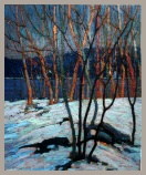
We will view our second example by using the graphic on page
six.
This painting is an example of unity by subordination. Strong
clearly contrasted shapes in the foreground followed by less
contrasted shapes in the middle-ground, followed by even less
contrasted shapes in the background.
My overall evaluation of this work is
unity by subordination.
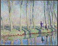
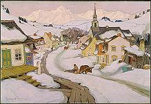
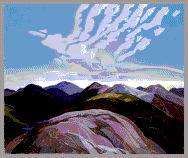
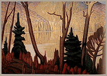
See following Graphic examples which
apply to this web site version of my notes:
|
|